On July 1, 1957, an unprecedented period of global scientific collaboration known as the International Geophysical Year began. Artificial satellites were launched, planetary weather observations were made for the first time, the understanding of plate tectonics was established, and more. Learn how the Army Map Service played a critical role during the IGY, providing the calculations that launched the U.S. into the space race.
Learn about the development of the oscillating scan mirror (a key component of Virginia Norwood's multi-spectral scanner), which made Landsat I a success, changing the science of earth observation forever. The development of the oscillating scan mirror is documented in the "Virginia Norwood Papers," a new collection in the Geography & Map Division of the Library of Congress.
This blog post highlights unusual maps found in the Geography and Map Division collections including a chart of port cities, a history of the Civil War, and a railroad organization chart.
I recently heard a factoid in passing that fascinated me and sparked further investigation: after having been decidedly middle of the pack immediately post-Civil War, the United States’ share of total world manufacturing output became the highest in the world between 1880 and 1900, with a near exponential pace of growth during these decades. Oddly, …
This blog posts provides an introduction to some early maps produced from images captured by ERTS-1 (later known as Landsat I), the world's first earth-observing satellite.
How have national and global populations been mapped over time? This blog post uses collection items from the Geography & Map Division at the Library of Congress to explore changing methods for mapping populations, from census-based thematic maps to modern population raster datasets.
Our new interactive map showcases the Climatological Database for the World's Oceans 1750-1850, an exciting digital acquisition of the Library of Congress.
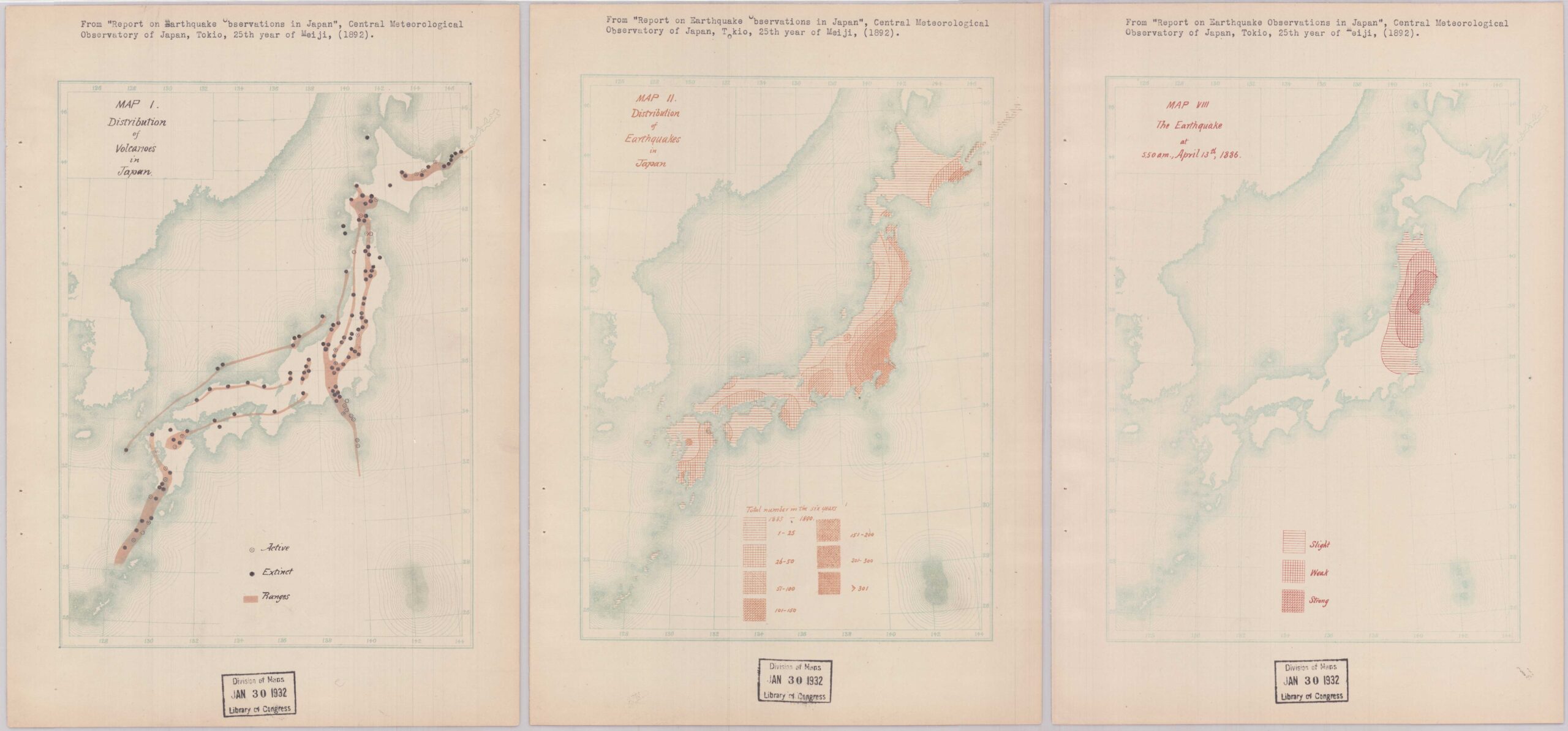
Did you know that worldwide, roughly 55 earthquakes are recorded per day? Of course, the vast majority of these seismic events are minor, making it all the more impressive that we are able to detect them. The technology used to gather data on earthquakes and seismic movements has vastly improved over time, and with it …
The end of the 19th century saw a rise in the proliferation of data visualizations alongside traditional cartography and thematic mapping. A terrific example of this type of work is Scribner’s Statistical Atlas of the United States, which “shows by graphic methods [the states’] present condition and their political, social, and industrial development.” The atlas …